Honestly, as a graphic designer, I found no use for it. These may be artists trying to get a living, but our group specializes in marketing, advertising, and creating big ideas using mix media.
Of course, as someone who wants to major in illustration hopefully, I learned quite a bit and took notes, but it was really weird...
We went to two places I can remember really well;
The Plug Project, which is a KC based art studio. They are a nonprofit group of volunteers that aim to highlight quality but somewhat unknown artists.
The Plug Project, which is a KC based art studio. They are a nonprofit group of volunteers that aim to highlight quality but somewhat unknown artists.
Basically, they are hipsters.
But what's interesting is that each exhibit they have, it's all based on something. Like people swimming or portraits.
Then, in a separate room, they have a KC artist that did something completely different.
Like someone running or sitting down, or a room without anyone.
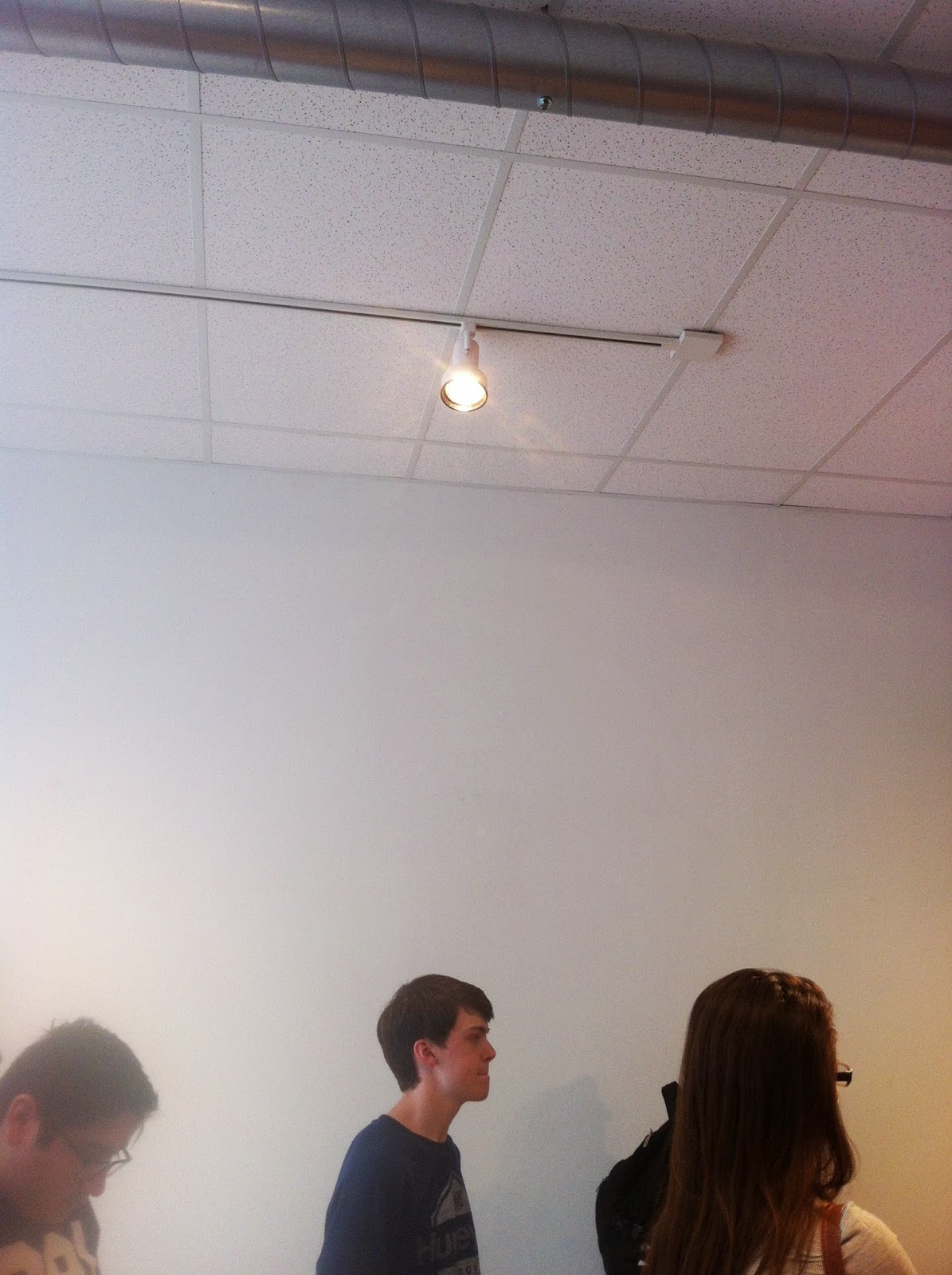
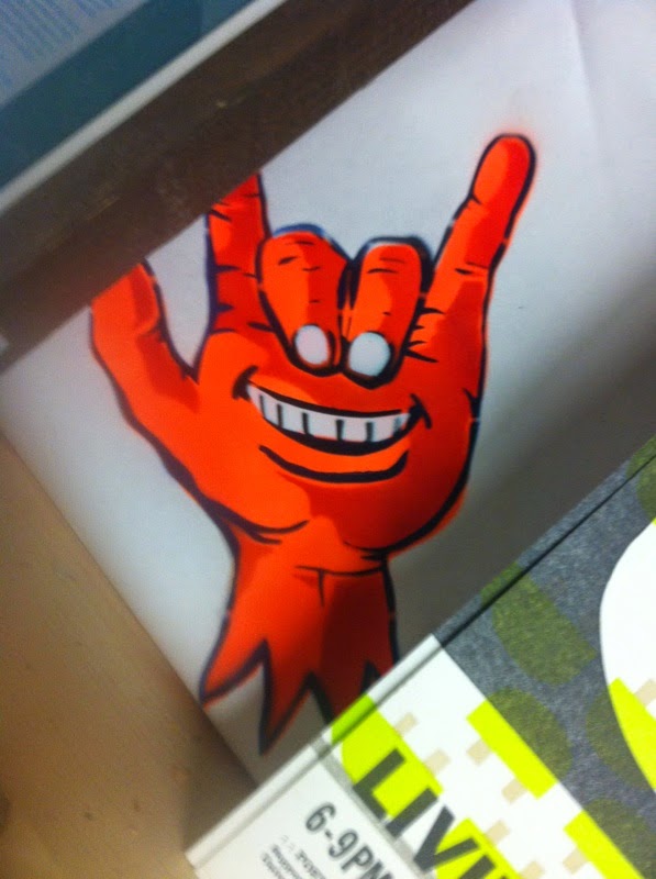
They didn't have any art up around when we came by, but I took a picture of this light (usually it's focused on artwork, I noticed it as accent lighting from an interior design class) and a spray painted drawing in a corner somewhere.
The second place we went to was an art studio called Bill Brady. I forgot if it was because of the artist's name, or if the artist just likes naming places with human names, but whatever works. Anyway, the art piece shown was a really awesome mix of television screens and printed tapestries, and these super awesome little spheres of different worlds..
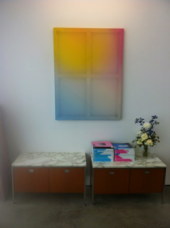 (The last picture was from when we first walked in, they had a buncha interesting geeky stuff, but then also this really cool window looking painting.)
They didn't have any art up around when we came by, but I took a picture of this light (usually it's focused on artwork, I noticed it as accent lighting from an interior design class) and a spray painted drawing in a corner somewhere.


The second place we went to was an art studio called Bill Brady. I forgot if it was because of the artist's name, or if the artist just likes naming places with human names, but whatever works. Anyway, the art piece shown was a really awesome mix of television screens and printed tapestries, and these super awesome little spheres of different worlds..
 (The last picture was from when we first walked in, they had a buncha interesting geeky stuff, but then also this really cool window looking painting.)


