Tuesday, February 24, 2015

All these bloody GIFs!

To start it off, GIF is pronounced with "Graphic"s G sound.
It isn't Jiff, that's peanut butter.

Because this project was based on GIFs, and not animation, I'll instead state GIF's original usage, it's current usage, and possibilities in the future, and then how I used it in Photoshop.

GIF is the
Graphic Interchange Format

Past.

GIF was created by the CompuServe.. They are mostly unknown now due to their late rise in the 1980s. They were then bought out by AOL, a company more people are familiar with.
GIF's original purpose was an image format. It could save in color, AND was extremely efficient, replacing the then RLE format entirely.

They ended up not fully enjoying the first, so they created another with slight changes, and createed a neat way for a computer to know the difference.

It became extremely popular as a file format, being the number one in choice for colored web images.
And while it could do animation, it didn't really see "Artistic" use until much more recent. (before then, film was more popular)

Present.

Currently, it's popular to save small clips of video as a GIF instead of a MP4. GIFs are smaller, and keep repeating which is awesome if in case you missed something important.


The above are examples of repeating GIFs that I just found online. One is about an owl being late to the party, another is a movie clip where a buncha germans hit the back of a Pinto and it exploded (referenced to the engineering flaw of the Ford Pinto)

Future.

Honestly, I don't see much of a future for GIFs. As internet speeds get faster, people are going to similar but other formats, such as WebM or GIFv, which basically play as higher quality gifs with an optional sound. (Yes, like an MP4, but it repeats without sound, making it almost like a Vine, but with less of it's controlling 9 seconds or w/e.

My GIF.

My GIF was inspired by some of the GIFs of Rebecca Mock.


Tutorial.

1)
Setting Up Canvas

In Photoshop, make a new file, by default I set the size to 1920x1080, and the resolution to 72. Having the color mode to RGB is preferred, but not needed.


2)
Planning

Going around in a new layer (not background, hssss..) and just plan out what you're thinking.
I don't have a picture for this one because I don't want to influence someone on what to do.
Just make it super busy and have as much stuff as possible.
As a general rule, have an odd amount of stuff because it makes things more interesting, but, really just try and get stuff on paper.
This can be all done in a single layer, it doesn't matter.

3)
Fine Tuning

On separate layers, flesh out individual objects. If you're planning on having things animated, separate it into two layers, the static layer and the active layer.

4)
Animation

After you're all done and ready to animate, in Window -> Timeline, create a "Video Timeline" (vs a Frame Animation)


This is now where everything gets fun..
Each layer you've made has it's own "Folder" in the timeline.
In it, there is Position, Opacity, Style, and Transform*.
And, this is a handy example of all of them;

*= Transform is an oddball; it only appears if you turn the layer into a smart object.
It makes sense, and is the only way you can transform something without it being present in all of it, but I'll leave that to your experimentation.

Animating this way is kinda... Complex. I'll try and walk you through it, but really someone else has probably found a better way to do it. I mostly found this via experimentation, so I trust you to that.

The Timeline works by tracking differences. You click a stop watch, and it starts measuring the difference. So, click the stop watch for position, change what time it is in the timeline, and then change the position. If you click play, photoshop will create frames from one object to the next. If you want it slow, you give more time to it, if you want it fast, you give it less time.

Opacity is similar.

Style refers to "Layer Style", and it tracks changes.. Really, there is a LOT in Layer Style, so I'm not even going to try and talk about every thing.. In my GIF, I used Color Overlay, and in the example above I used Gradient Overlay. Drop Shadow might look really cool when the sun is setting or rising, and really, I can't see a use for the rest, so just experiment.

Wednesday, February 18, 2015

Strong Suits of a murderer?

Okay, not exactly a murderer, more a crazy artist, w/e...

I was instructed to take a leadership test..
To be honest, I dislike personality tests, especially if they are to be taken seriously in an academic standpoint..
To run through it;

Empathy
Adaptablitiy
Strategic
Individualization
Communication

Empathy because I connect with people and I am.. Well, I am empathetic.

Adaptability because I can adapt?.. I honestly don't believe this that much, but.. Gallup Reports yo.
... OH, it's because I live in the moment. Weird...
I don't have much of a life anyway.

Strategic because... I sort through clutter and take the best route?...
Sound right.
I can read people well because of my empathy, and see the best way to go through things sometimes.

Individualization because I'm an individual and enjoy being unique. derpyderp.
I'm very professional, I know.

Communication should be lower on the list lool..
I am awful at talking about things...

Wooo..
So, that's my Gallup Report

also, it sounds like a horse.

Sunday, December 14, 2014

Another Field Trip!

One thing I really enjoy about a creative course in graphic design, while still being a part of high school, is that we get to go to different places and learn how people got there before we make leaps. We get to see what path people took to get to the really awesome places they've gotten to, and it lets us think with a bit more flexibility. For example, someone who majored in English and maybe became an editor could slowly find themselves in a graphic design related job, maybe working with readability of a commercial script, or something similar.

Our latest exploit, as of this writing, is getting to go to VML, which is a global ad agency that has a large branch nearby.

Wall of logos, these are all of the companies that VML works with, either in the present or the past. Not shown due to bad photo quality, a lot of these are colored, I think, if they work with them a LOT. I want to say Gatorade and Wendy's are, but I can't remember the rest.

We got to meet up with a lot of higher ups in the company, like the Executive Creative Art Director, Aaron Evanson, and talk about his job at VML and how he got there, but also some of the process of how to keep clients in the loop and how to make sure they know everything is doing okay.
Here is a brief summary of the notes I took:

They have a lot of different, unique talents that pool together to accomplish the same goal of making the client happy.
The process is slightly broken, because they need to explain their creative process to the most boring people, CEOs, Clients, etc, and they need to baby step them through things, and validate why they decided to go the way they did.
I sometimes need to do this with my own teachers (of course, not the teacher who let me go to VML and is grading this...)
The different colleges/majors they have done is
Iowa State and Graphic Design. He actually first was just in it for something else, but then changed when he found out more about graphic design.
KState and Chemistry, she said she had a long story over how she got where she did.
Notre Dame and Communications
There are a lot of good schools, like Mizzou has a good GD department.
Portfolio advice is to have it be unique and unexpected, 5 to 7 pieces, and if you're doing GD, have a 360 example, like logos, brochures, website ideas, colors, bags, coffee mugs, everything a company might logo themselves onto.
Google might have USBs and T-Shirts, and their doodle logos for special holidays.
Have a STRONG PORTFOLIO with personality.
Get more knowledgeable on Flash, and take public speaking classes to help pitch ideas with clients.


Friday, November 7, 2014

Museums and stuff?!

Recently (like, 2 weeks ago this time) we went to KC and walked around to various art studios and such, asking questions and such.
Honestly, as a graphic designer, I found no use for it. These may be artists trying to get a living, but our group specializes in marketing, advertising, and creating big ideas using mix media.
Of course, as someone who wants to major in illustration hopefully, I learned quite a bit and took notes, but it was really weird...

We went to two places I can remember really well;

The Plug Project, which is a KC based art studio. They are a nonprofit group of volunteers that aim to highlight quality but somewhat unknown artists.
Basically, they are hipsters.
But what's interesting is that each exhibit they have, it's all based on something. Like people swimming or portraits.
Then, in a separate room, they have a KC artist that did something completely different.
Like someone running or sitting down, or a room without anyone.
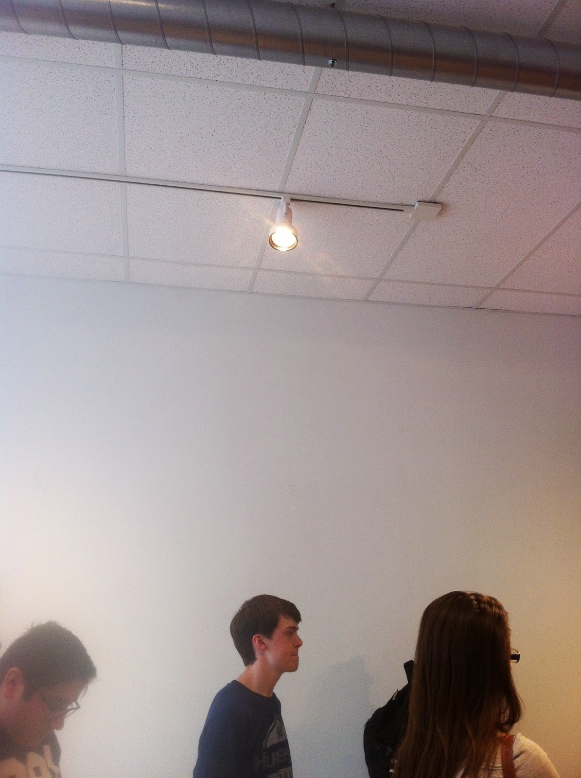
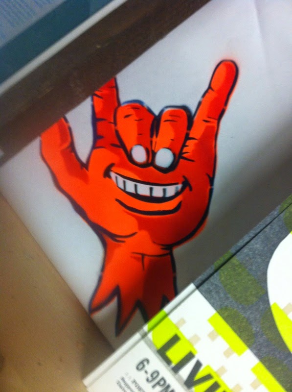
They didn't have any art up around when we came by, but I took a picture of this light (usually it's focused on artwork, I noticed it as accent lighting from an interior design class) and a spray painted drawing in a corner somewhere.


The second place we went to was an art studio called Bill Brady. I forgot if it was because of the artist's name, or if the artist just likes naming places with human names, but whatever works. Anyway, the art piece shown was a really awesome mix of television screens and printed tapestries, and these super awesome little spheres of different worlds..


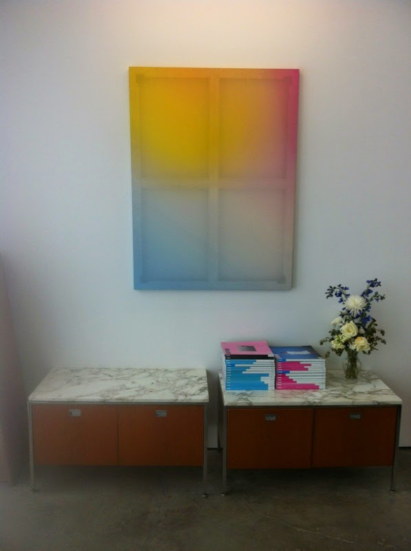
(The last picture was from when we first walked in, they had a buncha interesting geeky stuff, but then also this really cool window looking painting.) 

Painting in bloo-Photoshop.

A few weeks ago (maybe even a month ago, whooops) I was assigned to do a painting in photoshop using the mixing paint brush, The brush basically uses the same rules as an actual brush/paint where you need things to blend and if you're awful, then you get that nasty brown from mixing all of the colors.
The picture below was what I was given to paint-ify.

Personally, I hate the composition of this picture, but whatever. It seems too simple and it really doesn't help guide your eye through the piece.
An assignment is an assignment I suppose.


And then here is my finished painting. It looks kinda cool, I'm just happy it doesn't look like the example image (which was all awful and scratchy for some reason... Paintbrushes aren't scratchy?)

I already use this brush a little bit outside of assignemnts, it's fun messing with to create texture and odd gradients, and this was fun practice for it.

Our next project was to grab a different picture and make it all paintery on our own
Above is the image I used
And dadaaa, my final is below!


My biggest issue was trying to add the smaller details and still show a lot of the texture and motion of the water. Next time I'll try and get a bigger picture and use a smaller brush.

Our last project was to paint something without using something as a base/guide, so I drew a weird portrait of a friend of mine.


For Halloween, she dressed up as a dog. It looked really good on her, so I attempted to draw it from memory.

Thursday, October 9, 2014

End of the Murderous First Quarter!

Well, this quarter has been pretty chaotic, and, this being the last time I get to blog about it, I'll just highlight some stuff that I've been doing outside of class.

I was approached by a classmate asking if I could help them design a brochure for Cross Country. She was just the student aide of the photography teacher, and didn't seem to really know what she was doing. After she was let off the project, I managed to stay on to finish it.
Well... I completely redid it...
She started it in Photoshop, the only Adobe program you'd use for photography.
I redid it with InDesign.

A small preview

It was made for it to be folded, so the girl's are on the back, and the raven is on the front.

My second large project was an absolute nightmare, but mostly because poor planning... It's all a learning experience, I suppose.

My AP Art Studio teacher, also the teacher for National Art Honor's Society, usually uses Word to design a Calendar every year to get money for NAHS. We then use that money to do a variety of stuff like go on field trips. This year, she sought me out to do it, seeing that I probably could do it better than her.

It took me an hour to get everything plotted out on InDesign, and then I just waited for her to get me pictures. During that time, my graphic design teacher took the liberty to remind me every other day that I should start on it and have everything plotted out already, and every time I would remind her that I have it all done with already and I just needed pictures.

Man was I wrong..
I took an entire day just of Calendar stuff.. She had specific holidays she wanted to be showcased, with artist's birthdays. After I wrote those in, double checking some I was unsure on if they would change (Presidents day is always a Monday, while last year the date would make it a Tuesday) I then had to completely reformat it so that it would print right, because folded, one month shows the other's picture...
I then had to go around matching the months, getting artist names, double checking the spelling, and putting in the medium used...
How to fix this?
Request straight up what picture she wanted for each month, and the artist's full name and medium.
And then what dates she wanted to showcase, and just spend half an hour googling dates and writing them down.

Anyway, a sample of the cover.
Sure, the names aren't exactly centered correctly, but it was hard to get everything done as fast as she wanted it to be x_x

Oh, and, to make matters better, a friend of mine looked over the format after I went home, and I was told he reformatted it again because some stuff didn't match up.
So I'm waiting to see how they turned out, and if he messed things up...
(He doesn't have any knowledge with graphic design or InDesign...)'

I was told that I was supposed to have three pictures, but really, I like keeping just one sample picture per project... Weeee..

Bye bye people!

Wednesday, September 10, 2014

Bloody Typography!

This time around, I was tasked with labeling a font with just the usual stuff
Legs, arms, shoulders. counters, bowls, etc.
The idea was that the typography would have a piece of my personality, and so I did a quiz.
I told them I was emotional, and then I got a dot matrix font... Which really isn't emotional, but instead logical.
I don't know -shrug-
I feel like I'm missing a few, like the M might have a stroke instead of a stem, and I can't use any of the fancy G terminology because I don't have any Gs in my name.
Fun.