Sunday, December 14, 2014

Another Field Trip!

One thing I really enjoy about a creative course in graphic design, while still being a part of high school, is that we get to go to different places and learn how people got there before we make leaps. We get to see what path people took to get to the really awesome places they've gotten to, and it lets us think with a bit more flexibility. For example, someone who majored in English and maybe became an editor could slowly find themselves in a graphic design related job, maybe working with readability of a commercial script, or something similar.

Our latest exploit, as of this writing, is getting to go to VML, which is a global ad agency that has a large branch nearby.

Wall of logos, these are all of the companies that VML works with, either in the present or the past. Not shown due to bad photo quality, a lot of these are colored, I think, if they work with them a LOT. I want to say Gatorade and Wendy's are, but I can't remember the rest.

We got to meet up with a lot of higher ups in the company, like the Executive Creative Art Director, Aaron Evanson, and talk about his job at VML and how he got there, but also some of the process of how to keep clients in the loop and how to make sure they know everything is doing okay.
Here is a brief summary of the notes I took:

They have a lot of different, unique talents that pool together to accomplish the same goal of making the client happy.
The process is slightly broken, because they need to explain their creative process to the most boring people, CEOs, Clients, etc, and they need to baby step them through things, and validate why they decided to go the way they did.
I sometimes need to do this with my own teachers (of course, not the teacher who let me go to VML and is grading this...)
The different colleges/majors they have done is
Iowa State and Graphic Design. He actually first was just in it for something else, but then changed when he found out more about graphic design.
KState and Chemistry, she said she had a long story over how she got where she did.
Notre Dame and Communications
There are a lot of good schools, like Mizzou has a good GD department.
Portfolio advice is to have it be unique and unexpected, 5 to 7 pieces, and if you're doing GD, have a 360 example, like logos, brochures, website ideas, colors, bags, coffee mugs, everything a company might logo themselves onto.
Google might have USBs and T-Shirts, and their doodle logos for special holidays.
Have a STRONG PORTFOLIO with personality.
Get more knowledgeable on Flash, and take public speaking classes to help pitch ideas with clients.


Friday, November 7, 2014

Museums and stuff?!

Recently (like, 2 weeks ago this time) we went to KC and walked around to various art studios and such, asking questions and such.
Honestly, as a graphic designer, I found no use for it. These may be artists trying to get a living, but our group specializes in marketing, advertising, and creating big ideas using mix media.
Of course, as someone who wants to major in illustration hopefully, I learned quite a bit and took notes, but it was really weird...

We went to two places I can remember really well;

The Plug Project, which is a KC based art studio. They are a nonprofit group of volunteers that aim to highlight quality but somewhat unknown artists.
Basically, they are hipsters.
But what's interesting is that each exhibit they have, it's all based on something. Like people swimming or portraits.
Then, in a separate room, they have a KC artist that did something completely different.
Like someone running or sitting down, or a room without anyone.
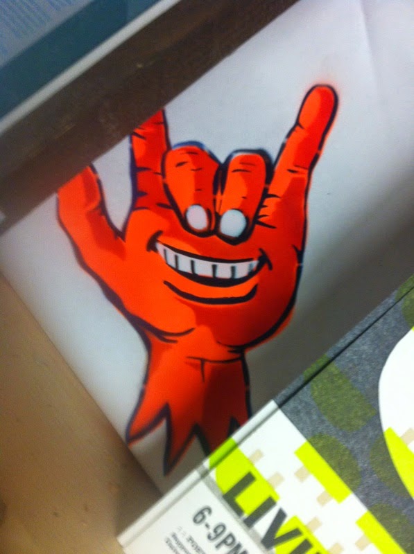
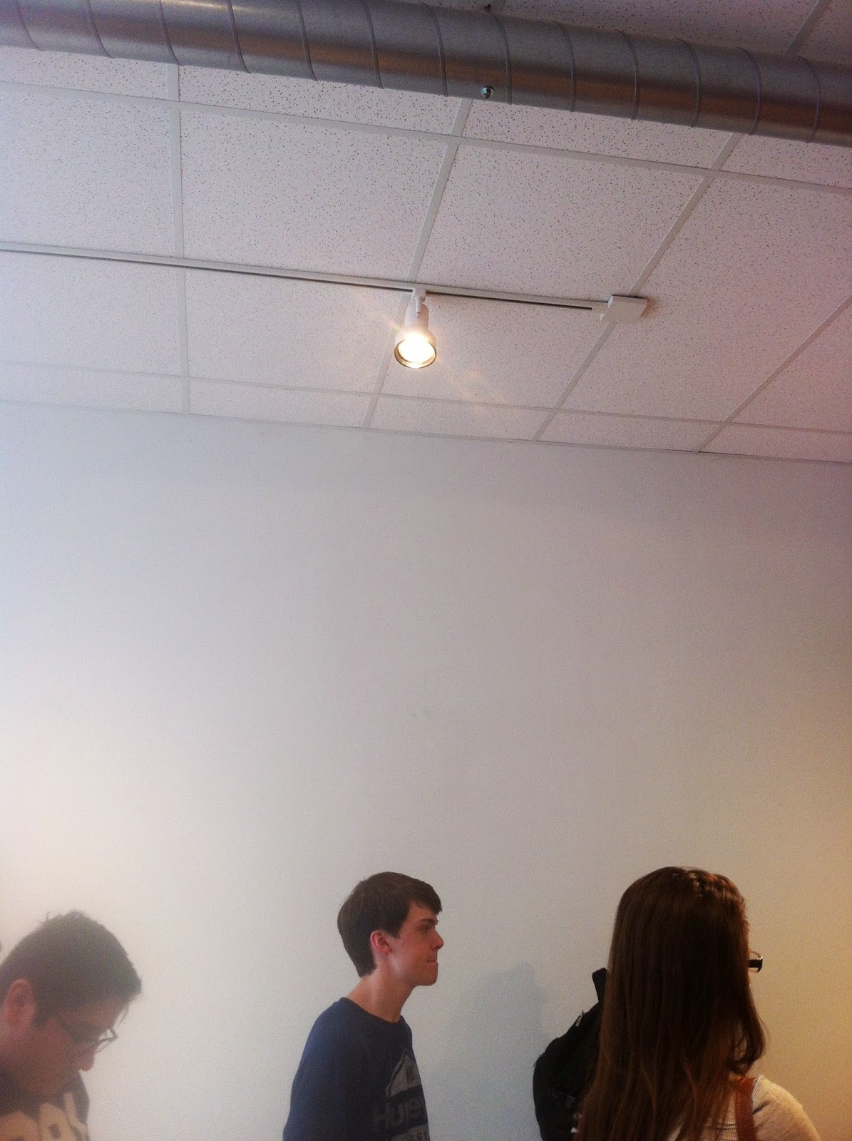
They didn't have any art up around when we came by, but I took a picture of this light (usually it's focused on artwork, I noticed it as accent lighting from an interior design class) and a spray painted drawing in a corner somewhere.


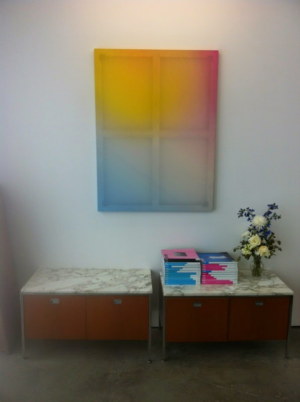
The second place we went to was an art studio called Bill Brady. I forgot if it was because of the artist's name, or if the artist just likes naming places with human names, but whatever works. Anyway, the art piece shown was a really awesome mix of television screens and printed tapestries, and these super awesome little spheres of different worlds..


(The last picture was from when we first walked in, they had a buncha interesting geeky stuff, but then also this really cool window looking painting.) 

Painting in bloo-Photoshop.

A few weeks ago (maybe even a month ago, whooops) I was assigned to do a painting in photoshop using the mixing paint brush, The brush basically uses the same rules as an actual brush/paint where you need things to blend and if you're awful, then you get that nasty brown from mixing all of the colors.
The picture below was what I was given to paint-ify.

Personally, I hate the composition of this picture, but whatever. It seems too simple and it really doesn't help guide your eye through the piece.
An assignment is an assignment I suppose.


And then here is my finished painting. It looks kinda cool, I'm just happy it doesn't look like the example image (which was all awful and scratchy for some reason... Paintbrushes aren't scratchy?)

I already use this brush a little bit outside of assignemnts, it's fun messing with to create texture and odd gradients, and this was fun practice for it.

Our next project was to grab a different picture and make it all paintery on our own
Above is the image I used
And dadaaa, my final is below!


My biggest issue was trying to add the smaller details and still show a lot of the texture and motion of the water. Next time I'll try and get a bigger picture and use a smaller brush.

Our last project was to paint something without using something as a base/guide, so I drew a weird portrait of a friend of mine.


For Halloween, she dressed up as a dog. It looked really good on her, so I attempted to draw it from memory.

Thursday, October 9, 2014

End of the Murderous First Quarter!

Well, this quarter has been pretty chaotic, and, this being the last time I get to blog about it, I'll just highlight some stuff that I've been doing outside of class.

I was approached by a classmate asking if I could help them design a brochure for Cross Country. She was just the student aide of the photography teacher, and didn't seem to really know what she was doing. After she was let off the project, I managed to stay on to finish it.
Well... I completely redid it...
She started it in Photoshop, the only Adobe program you'd use for photography.
I redid it with InDesign.

A small preview

It was made for it to be folded, so the girl's are on the back, and the raven is on the front.

My second large project was an absolute nightmare, but mostly because poor planning... It's all a learning experience, I suppose.

My AP Art Studio teacher, also the teacher for National Art Honor's Society, usually uses Word to design a Calendar every year to get money for NAHS. We then use that money to do a variety of stuff like go on field trips. This year, she sought me out to do it, seeing that I probably could do it better than her.

It took me an hour to get everything plotted out on InDesign, and then I just waited for her to get me pictures. During that time, my graphic design teacher took the liberty to remind me every other day that I should start on it and have everything plotted out already, and every time I would remind her that I have it all done with already and I just needed pictures.

Man was I wrong..
I took an entire day just of Calendar stuff.. She had specific holidays she wanted to be showcased, with artist's birthdays. After I wrote those in, double checking some I was unsure on if they would change (Presidents day is always a Monday, while last year the date would make it a Tuesday) I then had to completely reformat it so that it would print right, because folded, one month shows the other's picture...
I then had to go around matching the months, getting artist names, double checking the spelling, and putting in the medium used...
How to fix this?
Request straight up what picture she wanted for each month, and the artist's full name and medium.
And then what dates she wanted to showcase, and just spend half an hour googling dates and writing them down.

Anyway, a sample of the cover.
Sure, the names aren't exactly centered correctly, but it was hard to get everything done as fast as she wanted it to be x_x

Oh, and, to make matters better, a friend of mine looked over the format after I went home, and I was told he reformatted it again because some stuff didn't match up.
So I'm waiting to see how they turned out, and if he messed things up...
(He doesn't have any knowledge with graphic design or InDesign...)'

I was told that I was supposed to have three pictures, but really, I like keeping just one sample picture per project... Weeee..

Bye bye people!

Wednesday, September 10, 2014

Bloody Typography!

This time around, I was tasked with labeling a font with just the usual stuff
Legs, arms, shoulders. counters, bowls, etc.
The idea was that the typography would have a piece of my personality, and so I did a quiz.
I told them I was emotional, and then I got a dot matrix font... Which really isn't emotional, but instead logical.
I don't know -shrug-
I feel like I'm missing a few, like the M might have a stroke instead of a stem, and I can't use any of the fancy G terminology because I don't have any Gs in my name.
Fun.

Cubes Everywhere!

Following the tutorial on
http://www.lynda.com/Illustrator-tutorials/242-Creating-cube-differently-colored-cubes/76067/143225-4.html
I was tasked with both following his steps, changing it around, and then making it my own.

First, following his steps. Pretty simple and self explanatory.


This time around, I used his to create something new. The only thing that really changed was the increase of cubes (enough to fill the image) and the red. I chose the other colors, which make the yellow feel a tiny bit off. The dark doesn't seem dark enough...


And then here, trying to make something my own. Many people seemed to have been going in really odd directions, many people making abstract images by squashing shapes. Instead, I decided to take it one step further. If a squashed cube is still a cube, a rectangle (which a cube is) should work as well, right? I learned how to use the Extrude and tried to use it to create a block giraffe in the style of my drawing 1 class project.

Friday, August 29, 2014

Back to school blog post

My first assignment back was to blog about what Graphic Design relates to me, and why I cherish it.
When I was in... I want to say Freshman year, I went to a seminar with my best friend, and they defined Graphic Design as "the art or skill of combining elements"
They kept it open in order for it to define really anything anyone wanted to throw at it. You're making a logo? Combine colors in a way that works and makes sense. You're making a website or a brochure or a magazine cover or etc and you are just getting your elements and placing them down in a pleasing-to-the-eye manner.

WIth almost 4 years of E-Communication under my belt, and looking at Colleges, I'm starting to find less interest in Graphic Design. I love traditional art, and also love digital art... More than anything, I love mixed media. Trying to find out new ways to blend the regular painting or charcoal sketch and put it into a computer to really make it pop. I suppose this also makes sense since I enjoy Photoshop, which is barely used by seasoned pros in the field.
All that being said, I'm thinking of pursuing a job in Illustration. I get to delve into myself and try to develop my own style, while also getting taught more in depth on color theory and just general drawing.

Hopefully, I will get to learn more realistic/gritty stuff and also cartoony/innocent stuff on a variety of media.

Anyway, that's what graphic design is to me.
(Mixed Media Portrait by Danny O'Conner)
Paint

Friday, April 11, 2014

Kerning makes me feel dead inside

This game is honestly kinda interesting, because there is no real reason you'd need it unless if you wanted your kerning to be the very best it ever will be I guess?
I understand the potential value that could be given, to be the very best there ever was at looking at something and feeling something else is off..

OH, BEFORE I FORGET (I am really enjoying caps lately)
1) http://type.method.ac/#
2) PICTURE

Although, to be fair, this was my third attempt (maybe fourth?) and each time I learned something newww, like I didn't know more than one letter could be moved, while this time in particular it was 3 letters that had to be moved, I'm still kinda proud I got it.
I really wish I got the word Bloody, I feel like I'd get a perfect 1000/100 on that one.
PIXEL PERFECTIONN

eMagine bored me to deathh

Okay, not really bored, but it's hard to stay consistent and fresh all the time.

eMagine is an event held by E-Comm annually to celebrate students who are really good at what they do. It's structure is similar to an awards ceremony, but I also dislike how only E-Comm students are required to go, while if anyone from their schools doesn't want to, they don't have to. I had a fun time, but I think it would be much better if only people who really cared wanted to go, or maybe offer extra credit.

I know of many people who just decided not to go.

ANYWAY
I had a fun time going, and it was rather fun knowing half the people who got called up, but I also felt sorry for the few people who really poured their heart into it and they didn't get nearly as far.

Google's Doodles are killin' it

Although most people notice, I suppose some don't quite realize it.
Google doesn't have the most flexible of logo, but they try to make it work, well, for everything. They call it a Doodle, whenever there is a holiday or some big celebration, (someone important would be 155!, etc) then they make a specialized, sometimes even localized logo. That is, the US gets an Independence Day logo, while the UK or Canada doesn't have anything. There are many examples on http://www.google.com/doodles/finder/2014/All%20doodles

They even have contests regularly for certain events they hold, like I myself put in a piece, although it didn't get that far (if it got anywhere, I was really bad with digital art when I made it).
The rewards are awesome, so why not enter?
Well, besides that it is locked in to student entries, I suppose.

Edited to add pictureesss
Because I didn't realize how many people would add them in ;_;
I NEED TO CONFORMM

Monday, April 7, 2014

Bloody Dictatorship Away!!

We were instructed to make a minimalistic poster of an old movie, and I, loving all things open and understanding, decided to do The Great Dictator (1940).
It is a satirical political comedy-drama made by Charlie Chaplin about Hitler. (above is my poster, with the "Nazi" logo replacing eyes, with a Hitler mustache)
Our requirements were not many colors and 2-3 'things'

Friday, March 14, 2014

Bloody things everywhere!

My ten things:
Computer
Steam (game platform)
Sushi
Friends
Internet Connection
Emma (My girlfriend and bestfriend)
Photoshop
Crunchyroll
Portal (Video Game made by Valve)
Science

I made my computer myself, and am even going to update it later today. It's how I connect with the world, and it's also my canvas, having built it from the ground up.
I also really enjoy playing computer games, and prefer to think of myself as part of the "PC Master Race"

I really enjoy Science, although not every part of it equally, I find the quest of knowledge to be a noble one and am really interested in new findings. For example, a pure silicon disk capable of holding hundreds of terabytes by keeping data in 4 dimensions.

And, my poster, made by Emma Eastman, over at http://emmasportfoliowork.blogspot.com/

Wednesday, February 12, 2014

Bloody Great Time!

This field trip to the museum was very interesting, with really different types of art.
This is probably one of my favorite works, just because of the variety of shapes, from lines and perfect circles to free form curves. I also love the color, although random, they seem to balance themselves out. Pieces like this help remind me that a piece doesn't have to be perfect through and through to have a perfect look at the end.
These butterfly wings are attached to tiny motors which slowly beat the wings. From just looking at the shadow, they actually look like butterflies, until you get close up. I find this to be a very interesting way to show color, while at the same time shadows help create the effect.
This was located in the museum's cafe. I really loved this piece just because it is carved wood, but from far away they look like stone. I really love wood and stone, so having one imitate the other was just fantastic.

We didn't spend all of our time here, we also visited KCAI where we got to tour the place and look at the various things they did there. Although I didn't get any spectacular pictures of the rooms, I did get one of the stair case, just because it looked like they really tried to make it look like wood.
You can also see a graphic on a wall below. They have random graphics all over the place, and makes it feel like there is one person there who is really sticker happy and wants to post things all over the place. Reminds me of my laptop...

Although I don't have any pictures of the studios (I was busy listening to them!) we also visited some small studios, having 4 people in them at most. 
The first one I went into was for a claymation team for KCAI who got a grant to pay for the studio. They needed the studio to control the lighting in the room and whenever they took shots. 
The next one we went into was a printing studio that manually prints using silk screens. He talked about the positives of it versus printer printing and he showcased his work. We also talked about how to make one (it's a rather simple process, surprisingly.)
The last one we visited was a clothing designer. To be honest, I didn't quite understand what she did, she had many bolts of fabric and tiny samples of many designs next to each other. It was really unique, and I liked it. She talked a lot about the programs she used, and I wasn't interested enough to pay attention. Whoops.